
PROJECT CASE STUDY
BUILDING BLOCKS
The Snack That Builds You
A cohesive brand identity and packaging system positioning Building Blocks as the purposeful snack for active, goal-driven lifestyles.

01 / PROJECT OBJECTIVE
STRATEGY + VISION
Build a brand that earns its place in the gym bag.
The brief called for a complete brand identity and packaging system that positions Building Blocks as a purposeful snack for active lifestyles. Every element - name, shape, structure, color - had to work together to communicate function, trust, and personality.
The challenge: make a snack feel like serious nutrition without losing approachability.
BRAND STRATEGY
Position Building Blocks as a premium, purposeful snack brand rooted in active lifestyle culture and nutritional intent.
PACKAGING SYSTEM
Design a modular packaging architecture that differentiates three distinct product variants while maintaining a unified brand family.
VISUAL IDENTITY
Develop a complete identity system - logo, typography, color, illustration - that scales from packaging to billboard to digital.
02 / CONCEPT & BRAND IDENTITY
VISUAL IDENTITY SYSTEM
Everything is a building block.
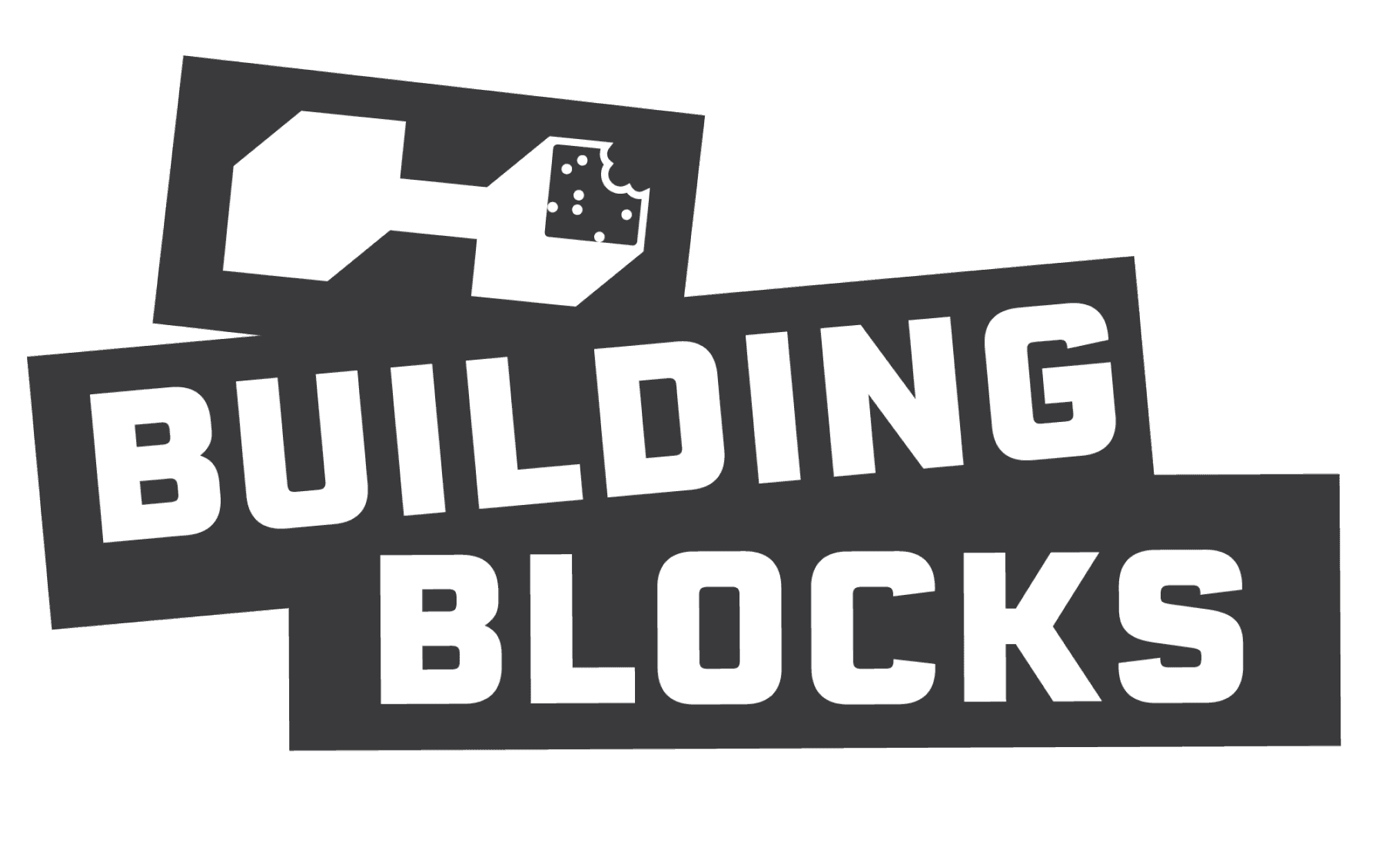
Nutrients are the building blocks of performance. Every design connects back to this central idea. The name Building Blocks informed the entire visual language. The product is cube-shaped. The logo is geometric. The illustrations show figures in motion-stacking, lifting, building.
01 / VISUAL HAMMER & SLOGAN

02 / 3D SNACK MODEL VARIANTS

01 / PRIMARY LOGO

03 / PRODUCT VARIATION LOGO SYSTEM


03 / PACKAGING DESIGN
STRUCTURAL + SURFACE DESIGN
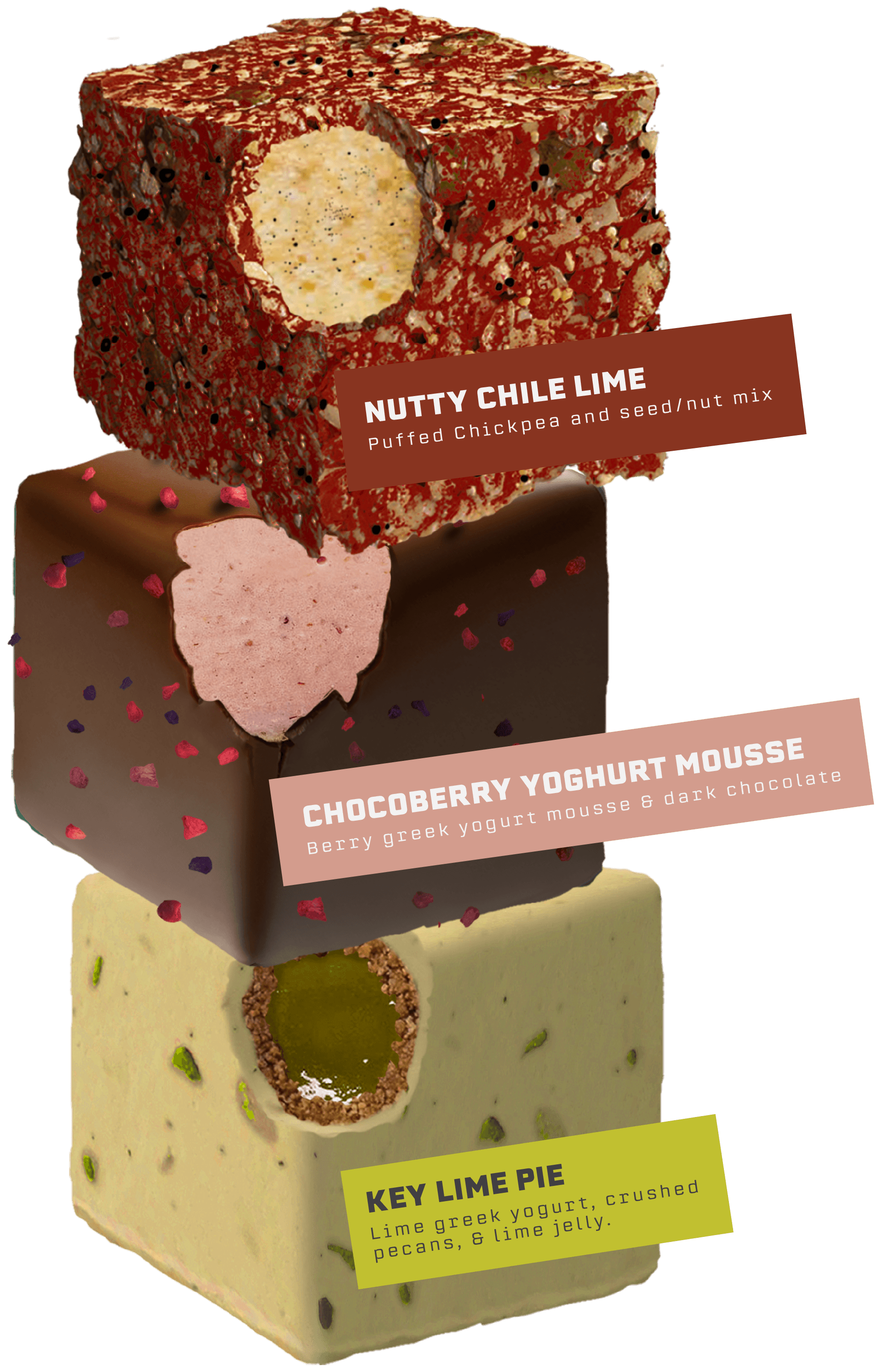
The packaging system is the brand in three dimensions. Each variant shares a structural cube form and brand architecture - only the color story and product personality shift. The result is a family that reads as one on shelf, but speaks individually to each athlete.

01 / WRAPPER PACKETS

02 / STACKED PRODUCT DETAIL
03 / STRUCTURAL DIE LINES
Each variant's die line documents the full packaging architecture - front, back, side panels, and tab structure - adapting the shared template to each product's distinct color and content.

EXPAND SCHEMATIC
01 / THE MUSCLE BLOCK — DIE LINE SCHEMATIC
SLIDE 01 / 03
Flat layout blueprint detailing the exact dimensions, cut-folds, gluing tabs, and surface ink mapping for the Muscle Block variant. Shared modular cube structure is plotted at 1:1 architectural scale.
02 / PACKAGE CONCEPT SKETCHES

04 / PRODUCT LINE
THREE VARIANTS · ONE SYSTEM
Three distinct product variants, each targeting a specific performance goal. The shared cube form and brand architecture unite them as a family - individual color stories and product naming distinguish them on shelf.

VARIANT 01
The Muscle Block
High-protein build formula. Designed for strength athletes and gym-goers focused on muscle development.

VARIANT 02
The Recovery Block
Post-workout recovery blend. L-Glutamine and antioxidant-rich ingredients formulated for rest and repair.

VARIANT 03
The Cardio Block
Endurance and energy formula. Light, plant-forward ingredients for runners, cyclists, and cardio-focused athletes.
05 / FINAL SHOWCASE
IN-CONTEXT APPLICATIONS


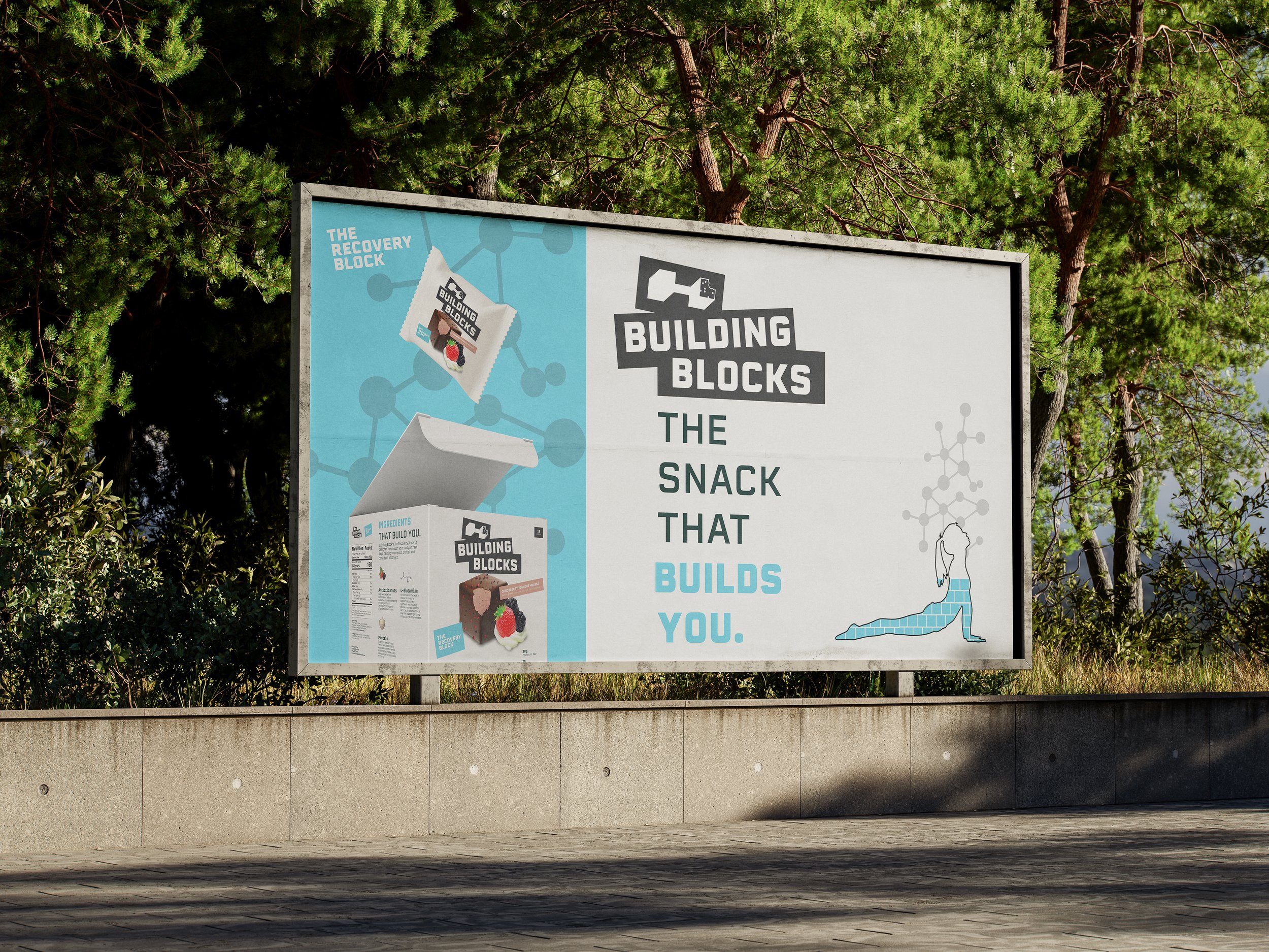
Building Blocks was a comprehensive exploration of brand identity and packaging design - from structural die lines to billboard applications. The project demonstrated how a single strong concept can scale across every touchpoint of a brand.
PROJECT COMPLETE
BB
02 / LOGOMARK CONSTRUCTION